Everything Apple

Tuesday 31 July 2018

Apple nears a $1 trillion market cap as it clears another quarter ahead of expectations

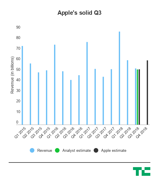
Apple is inching closer and closer to becoming a $1 trillion company today after posting third quarter results that beat out what analysts were expecting and bumping the stock another few percentage points — which, by Apple standards, is tens of billions of dollars.

The company’s stock is up around 2.5% this afternoon after the report, which at a prior market close with a market cap of around $935 billion, is adding nearly another $20-plus billion to its market cap. A few quarters ago we were walking about how Apple was in shooting distance of that $1 trillion mark, but now it seems more and more like Apple will actually hit it. Apple is headed into its most important few quarters as we hit the back half of the year, with its usual new lineup of iPhones and other products and its accompanying critical holiday quarter.

Here’s a quick breakdown of the numbers:

  • Revenue:  $53.3 billion, up 17% year-over-year compared to analyst expectations of $52.34 billion.
  • Earnings: $2.34 per share compared to analyst estimates of $2.18 per share.
  • iPhones: 41.3 million, up 1% year-over-year though revenue on the iPhone line was up 20% year-over-year. Analysts expected 41.79 million iphones sold.
  • iPhone average selling price: $724
  • iPads: 11.55 million, up 1% year-over-year but ahead of analyst expectations of 10.3 million.
  • Macs: 3.7 million, down 13% year-over-year and behind analyst expectations
  • Services: $9.6 billion, up 31% year-over-year.
  • Other products: $3.7 billion, up 37% year-over-year.

So in all, the shipment numbers were hit or miss at a granular level, but at the same time the iPhone is generating a lot more revenue than it did last year — implying that there might be a shifting mix toward more expensive iPhones. Apple’s strategy to figure out if it could unlock a more premium tier in consumer demand, then, may be panning out and helping once again drive the company’s growth. It’s then pading out the rest of that with growth in services and other products like it has in the past few quarters as Apple heads into the end of the year.

In the past year or so, Apple’s stock has continued to rise even though there may have been some dampened expectations for its latest super-premium iPhone, the iPhone X. Its shares are up more than 20% in the past year, and in the second quarter the company announced that it would return an additional $100 billion to investors in a new capital return program, which at the time also sparked a considerable jump in its stock. Apple hasn’t delivered a product that has entirely changed the market calculus like it did when it first started rolling out larger iPhones, but its strategy of incremental improvements and maneuvering in Wall Street continues to provide it some momentum as it heads toward $1 trillion.

Dixons Carphone now says ~8.8M more customers affected by 2017 breach

A Dixons Carphone data breach that was disclosed earlier this summer was worse than initially reported. The company is now saying that personal data of 10 million customers could also have been accessed when its systems were hacked.

The European electronics and telecoms retailer believes its systems were accessed by unknown and unauthorized person/s in 2017, although it only disclosed the breach in June, after discovering it during a review of its security systems.

Last month it said 5.9M payment cards and 1.2M customer records had been accessed. But with its investigation into the breach “nearing completion”, it now says approximately 10M records containing personal data (but no financial information) may have been accessed last year — in addition to the 5.9M compromised payment cards it disclosed last month.

“While there is now evidence that some of this data may have left our systems, these records do not contain payment card or bank account details and there is no evidence that any fraud has resulted. We are continuing to keep the relevant authorities updated,” the company said in a statement.

In terms of what personal data the 10M records contained, a Dixons Carphone spokeswoman told us: “This continues to relate to personal data, and the types of data that may have been accessed are, for example, name, address or email address.”

The company says it’s taking the precaution of contacting all its customers — to apologize and advise them of “protective steps to minimize the risk of fraud”.

It adds it has no evidence that the unauthorized access is continuing, having taken steps to secure its systems when the breach was discovered last month, saying: “We continue to make improvements and investments at pace to our security environment through enhanced controls, monitoring and testing.”

Commenting in a statement, Dixons Carphone CEO, Alex Baldock, added: “Since our data security review uncovered last year’s breach, we’ve been working around the clock to put it right. That’s included closing off the unauthorised access, adding new security measures and launching an immediate investigation, which has allowed us to build a fuller understanding of the incident that we’re updating on today.

“Again, we’re disappointed in having fallen short here, and very sorry for any distress we’ve caused our customers. I want to assure them that we remain fully committed to making their personal data safe with us.”

Back in 2015, Carphone Warehouse, a mobile division of Dixons Carphone, also suffered a hack which affected around 3M people. And in January the company was fined £400k by the ICO as a consequence of that earlier breach.

Since then new European Union regulations (GDPR) have come into force which greatly raise the maximum penalties which regulators can impose for serious data breaches.

Last month, following Dixon’s disclosure of the latest breach, the UK’s data watchdog, the ICO, told us it was liaising with the National Cyber Security Centre, the Financial Conduct Authority and other relevant agencies to ascertain the details and impact on customers.

Of the 5.9M payment cards which Dixons disclosed last month as having been compromised, it said the vast majority had been protected by chip and PIN technology. But around 105,000 lacked the security tech so Dixons said at the time could therefore have been compromised.

It’s the additional 1.2M records containing non-financial personal data — such as name, address or email address — that have been revised upwards now, to ~10M records, which constitutes almost half the Group’s customer base in the UK and Ireland.

The spokeswoman told us the Group has approximately 22M customers in the region.

Monday 30 July 2018

YouTube’s dark theme has started gradually rolling out to Android

A dark theme option for YouTube users on Android is in the early stages of rolling out to end users, Google confirmed to TechCrunch, following a number of reports and sightings of the dark mode showing up for users in the app’s settings. The feature has taken a bit longer to launch than expected – YouTube first announced a dark mode for its mobile app back in March, when it launched on iOS. At the time, the company said the dark theme for Android was coming “soon.”

Five months later, well, here it is.

Similar to its iOS counterpart, the dark theme is toggled on or off in the Android app’s Settings. When enabled, YouTube’s usual white background switches to black throughout the YouTube app experience as your browse, search and watch videos.

The dark theme has a variety of benefits for end users. It gives watching videos a more cinematic feel, for starters. And when you’ve been staring at your screen for a long time, it can help you to better focus on the content, and not the controls. It can also help to cut down on glare, and help viewers take in the true colors of the videos they watch, the company previously explained.

Plus, some tests have shown dark themes can save battery life – something that’s particularly useful for YouTube’s 1.8 billion monthly users, who are spending more than an hour per day watching YouTube videos on mobile devices.

[gallery ids="1682814,1682813"]

Above: Image credits, Imgur user absinth92

YouTube first introduced a dark theme in May 2017, when it debuted a series of enhancements to its desktop website, including its simpler, Material Design-inspired look. At the time, it said a dark theme for mobile was a top request.

The YouTube app isn’t alone in catering to users’ desire for a dark mode. Other high-profile apps have gone this route as well, including Twitter, Reddit, Twitter clients like Tweetbot and Twitterific, Reddit clients like Beam, Narwhal, and Apollo, podcast player Overcast, calendar app Fantastical, Telegram X, Instapaper, Pocket, Feedly and others.

Google told us that the dark theme for YouTube on Android is still in the early phases of a gradual rollout, and it will have more updates about this launch in the “coming weeks.”

The change arrives alongside update a YouTube Community Manager shared in YouTube’s Help Forum about YouTube’s adaptive video player. The player on desktop now removes the black bars alongside 4:3 and vertical videos, by adjusting the viewing area accordingly, they said.

Fabric offers an alternative to Facebook sharing with a private timeline of personal moments

Fabric, a personal journaling app that emerged from Y Combinator’s 2016 batch of startups, is relaunching itself as a Facebook alternative. The app is giving itself a makeover in the wake of Facebook’s closure of the Moves location tracker, by offering its own tool to record your activities, photos, memories and other moments shared with friends and family. But unlike on Facebook, everything in Fabric is private by default and data isn’t shared with marketers.

Instead, the startup hopes to build something users will eventually pay for, via premium features or subscriptions.

The idea for the startup came from two people who helped create Facebook’s core features.
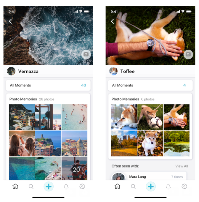
Co-founders Arun Vijayvergiya and Nikolay Valtchanov worked for several years at the social network, where Vijayvergiya built the product that would later become Facebook Timeline at an internal hackathon. He also worked on products like Friendship Pages, Year in Review and On This Day, while Valtchanov developed integrations between Facebook and fitness applications.

After leaving Facebook, both were inspired to work on Fabric because of their interest in personal journaling – and that became the key focus for the original version of the Fabric app. But while other journaling apps may offer a blank space for recording thoughts, Fabric automates the process by pulling in photos, posts from elsewhere on social media, places you visited, and more, and put those on its map interface.
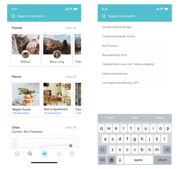
The longer-term goal is that Fabric users will be able to look back across their personal history to answer any kind of question about where they had been, what they did, and who they were with – but in a more private environment than what’s available on Facebook.

Facebook could have built something similar, but its focus has been more on how personal profile data could be useful to advertisers.

Despite numerous check-ins, posts where you tagged friends, shared photos and more, there’s still not an easy way to ask Facebook about that great Indian restaurant you tried last March, or who was on that group beach trip with you a few years ago, for example. At best, Facebook offers memory flashbacks through its On This Day feature (now available at any time via the Memories tab), or round-ups and collages that appear at various times throughout the year.

As a search engine for your own memories, it’s not that great.

What’s New 

This is where Fabric comes in. It will automatically record your activities, checking you in to places you visit, which you can then choose to add friends to.

While the idea of automatic location gathering may turn a good number of users off, the difference is that Fabric’s data collection is meant for your eyes only, unless you explicitly choose to share something with friends.

Fabric doesn’t use third-party software for its location system – it’s written in-house, so the data is never touched by a third-party. It also uses industry standard encryption for data transfer and storage, and login information is stored in a separate system from the rest of your data as an added precaution.

Notably, Fabric doesn’t plan to generate revenue by selling data or offering it to advertisers for targeting purposes. Instead, the company hopes users will eventually pay for its product – perhaps as a subscription or through premium upgrades. (It’s not doing this yet, however.)

“The whole motivation behind Fabric is that many meaningful parts of your life do not belong in the public sphere,” explains Vijayvergiya. “In order to be able to capture these moments, user trust is essential and is something we have baked into our company culture. Internally, we refer to ourselves as a ‘private-first’ company. Everything on Fabric is private by default. You have to choose to include friends in your moments. We don’t share any data with marketers, and we don’t intend to share personally identifiable information with advertisers,” he says.

Since its 2016 release, Fabric has been downloaded 70,000 times by users across 117 countries, and has seen 112 million automatic check-ins.

The new version of the app has been redesigned to be something users engage with more often, as opposed to the more passive journaling app it was before.
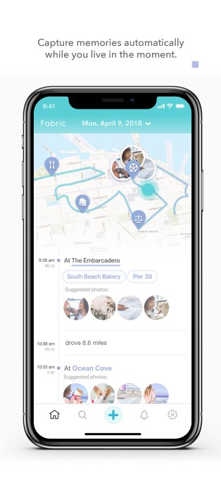
The app now offers an outline of your activities, which it also calls Timeline. Here, you can add people, photos and memorable anecdotes to those automated entries. You can jump back to any day to see your history with any person or place that appears on the Timeline.

You can also turn any moment into one you collaborate on with friends, by allowing others to add photos and comments. That is, instead of broad post to a group of so-called “friends” on Facebook, you share the moment with those who really matter. This isn’t all that different from how people use private messaging apps and group chats today – in order to share things with people that aren’t necessarily meant for everyone to see.
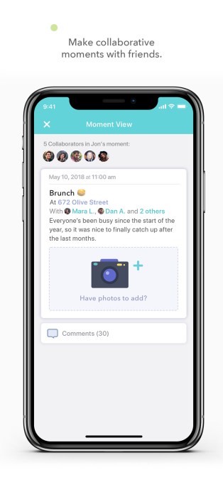
In addition, Fabric allows you to add your friends to the app, so you can be automatically tagged when you both spend time together in the real world. This also simplifies sharing because you won’t have to think about which posts should be shared with which audience.

For instance, Vijayvergiya says, “this means you can add your mom as a friend, and only share with her the moments you spend together in the same place.”

The most compelling feature in the updated app may not be check-ins or sharing, but search.

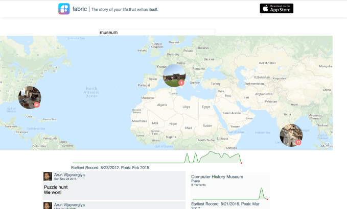
In Fabric, you can now search for past events in your life similar to how you search the web. That is, you could type in “restaurant rome 2017” or “camila los angeles birthday” and find the matching posts, Vijayvergiya suggests. And because you can import your Facebook, Instagram, and Camera Roll to Fabric, it’s now offering the search engine that Facebook itself forgot to build. (You can import your Facebook Moves history, too, ahead of its shutdown.)

Fabric’s search will also be available on the desktop web, where it’s currently in beta.
Fabric’s real challenger, as it turns out, may not be Facebook, though. It’s Google Photos.

Because of advances in image recognition technology, Google Photos (and some other photo apps) have built advanced search capabilities that let you pull up not places, things, people, and more, using data recognized in the image itself. Users can also share those photos with others, collaborate on albums, and leave notes as comments.

The difference is that Fabric offers import from a variety of sources and encourages journaling. But that may not be enough to attract a large user base, especially when automatic check-ins rely on the app’s use of background location which has some impact on battery life.

Fabric is a free download on iOS.


This is what the next iPhone could look like

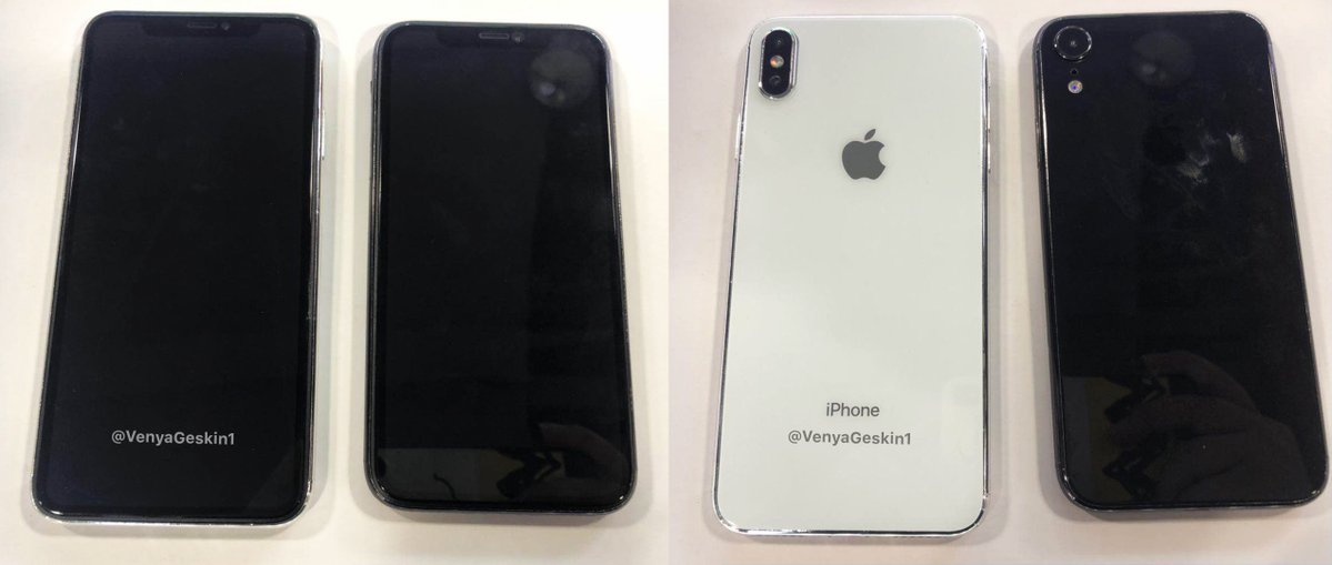
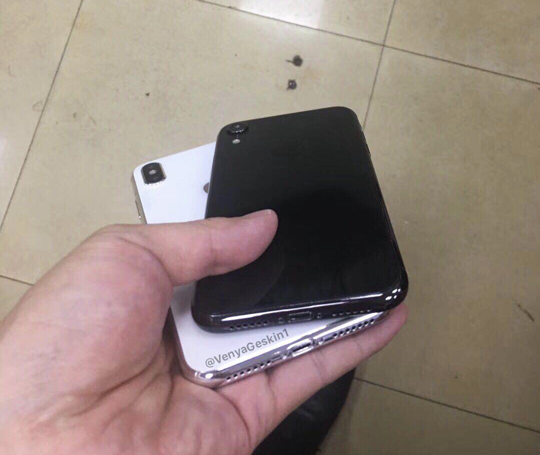
Several dummy units of future iPhone models have leaked over the weekend. It gives a good idea of what you should expect to see in September when Apple introduces the next iPhone.

Most likely, the iPhones on these photos aren’t actual iPhones. They are just dummy units. Every year, a few manufacturers create objects that look exactly like future iPhones.

They are based on leaked design schematics and usually look just like the real thing. Case manufacturers and other accessory makers buy those dummy units to get ready before Apple’s announcement.

Ben Geskin shared photos of two different phones — a bigger iPhone X and a new iPhone that looks a bit like the iPhone X but with a single camera lens. These devices line up with previous rumors.

As you can see, the bigger device looks just like the existing iPhone X, but bigger. It’s a 6.5-inch second-gen iPhone X Plus. It has two cameras at the back and the familiar notch at the top of the display.

According to rumors, the second-gen iPhone X Plus could cost $999, or the same price or the iPhone X today. Apple could also update the regular 5.8-inch iPhone X with better components and a lower price — $899.

But what about that mysterious 6.1-inch iPhone?

Apple wants to offer a more affordable iPhone with a notch for $700. Unlike the second-gen iPhone X and iPhone X Plus, this new iPhone could feature a slightly bigger bezel and an LCD display. OLED is still much more expensive than LCD, so it’s hard to roll it out across the entire lineup.

Apple could also put a single camera at the back of the device and use aluminum instead of stainless steel on the borders. Dimitri12 also shared photos of dummy units on Slashleaks that look like Geskin’s dummies:

When it comes to colors, analyst Ming-Chi Kuo reported that the cheaper model should come in many different colors — grey, white, blue, red and orange. The second-gen iPhone X and iPhone X Plus should come in black, white and gold.

Apple is expected to announce new iPhones in early September. So you should take those dummy units with a grain of salt.

Friday 27 July 2018

Why unskippable Stories ads could revive Facebook

Prepare for the invasion of the unskippables. If the Stories social media slideshow format is the future of mobile TV, it’s going to end up with commercials. Users won’t love them. And done wrong they could pester people away from spending so much time watching what friends do day-to-day. But there’s no way Facebook and its family of apps will keep letting us fast-forward past Stories ads just a split-second after they appear on our screens.

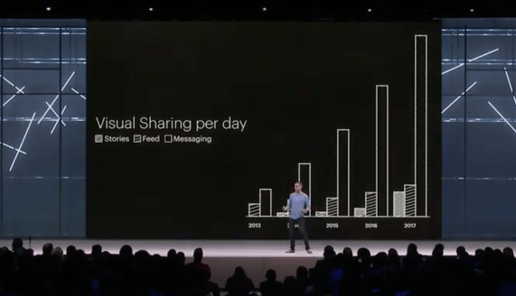
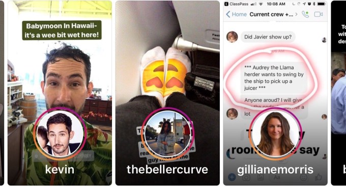
We’re on the cusp of the shift to Stories. Facebook estimates that across social media apps, sharing to Stories will surpass sharing through feeds some time in 2019. One big reason is they don’t take a ton of thought to create. Hold up your phone, shoot a photo or short video, and you’ve instantly got immersive, eye-catching, full-screen content. And you never had to think.

Facebook CPO Chris Cox at F8 2018 charts the rise of Stories that will see the format surpass feed sharing in 2019

Unlike text, which requires pre-meditated reflection that can be daunting to some, Stories are point and shoot. They don’t even require a caption. Sure, if you’re witty or artistic you can embellish them with all sorts of commentary and creativity. They can be a way to project your inner monologue over the outside world. But the base level of effort necessary to make a Story is arguably less than sharing a status update. That’s helped Stories rocket to over 1.3 billion daily users across Facebook’s apps and Snapchat.

The problem, at least for Facebook, is that monetizing the News Feed with status-style ads was a lot more straightforward. Those ada, which have fueled Facebook’s ascent to earning $13 billion in revenue and $5 billion in profit per quarter, were ostensibly old-school banners. Text, tiny photo, and a link. Advertisers have grown accustomed to them over 20 years of practice. Even small businesses on a tight budget could make these ads. And it at least took users a second to scroll past them — just long enough to make them occasionally effective at implanting a brand or tempting a click.

Stories, and Story ads, are fundamentally different. They require big, tantalizing photos at a minimum, or preferably stylish video that lasts five to fifteen seconds. That’s a huge upward creative leap for advertisers to make, particularly small business who’ll have trouble shooting that polished content themselves. Rather than displaying a splayed out preview of a link, users typically have to swipe up or tap a smaller section of a Story ad to click through.

And Stories are inherently skippable. Users have learned to rapidly tap to progress slide by slide through friends’ Stories, especially when racing through those with too many posts or that come from more distant acquaintances. People are quick with the trigger finger the moment they’re bored, especially if it’s with an ad.

A new type of ad blindness has emerged. Instead of our eyes glazing over as we scroll past, we stare intensely searching for the slightest hint that something isn’t worth our time and should be skipped. A brand name, “Sponsored” label, stilted product shot, or anything that looks asocial leads us to instantly tap past.

This is why Facebook COO Sheryl Sandberg scared the hell out of investors on the brutal earnings call when she admitted about Stories that “The question is, will this monetize at the same rate as News Feed? And we honestly don’t know.” It’s a radically new format advertisers will need time to adopt and perfect. Facebook had spent the past year warning that revenue growth would decelerate as it ran out of News Feed ad inventory, but it’d never stressed the danger as what is was: Stories. That contributed to its record-breaking $120 billion share price drop.

The shift from News Feed ads to Stories ads will be a bigger transition than desktop ads to mobile ads for Facebook. Feed ads looked and worked identically, it was just the screen around them changing. Stories ads are an entirely new beast.

Stories Ads Are A Bigger Shift Than Web To Mobile

There is one familiar format Stories ads are reminiscent of: television commercials. Before the age of TiVo and DVRs, you had to sit through the commercials to get your next hit of content. I believe the same will eventually be true for Stories, to the tune of billions in revenue for Facebook.

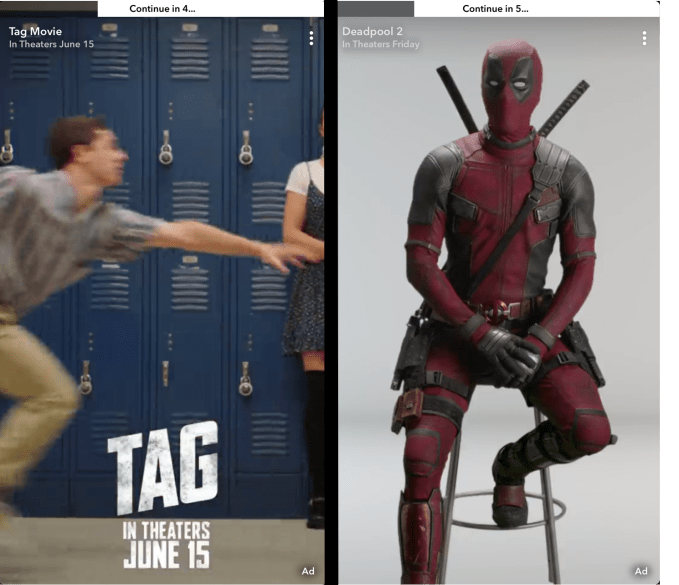
Snapchat is cornered by Facebook’s competition and desperate to avoid missing revenue estimates again. So this week, it rolled out unskippable vertical video ads it actually calls “Commercials” to 100 more advertisers, and they’ll soon be self-serve for buyers. Snap first debuted them in May, though the six-second promos are still only inserted into its longer-form multi-minute premium Shows, not user generated Stories. A Snap spokesperson said they couldn’t comment on future plans. But I’d expect its stance will inevitably change. Friends’ Stories are interesting enough to compel people to watch through entire ads, so the platforms could make us.

Snapchat is desperate, and that’s why it’s already working on unskippable ads. If Facebook’s apps like Instagram and WhatsApp were locked in heated battle with Snapchat, I think we’d see more brinkmanship here. Each would hope the other would show unskippable ads first so it could try to steal their pissed off users.

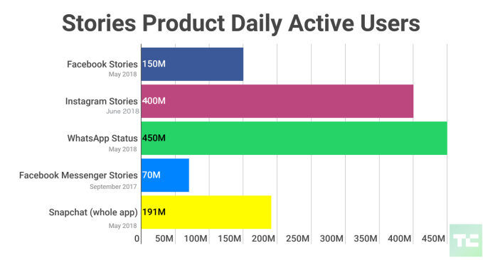
But Facebook has largely vanquished Snapchat, which has seen user growth sink significantly. Snapchat has 191 million daily users, but Facebook Stories has 150 million, Messenger Stories has 70 million, Instagram Stories has 400 million, and WhatsApp Stories (called Status) leads with 450 million. Most people’s friends around the world aren’t posting to Snapchat Stories, so Facebook doesn’t risk pushing users there with overly aggressive ads except perhaps amongst US teens.

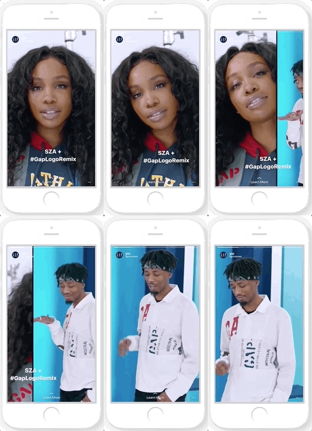
Instagram’s three-slide Stories carousel ads

That’s why I expect we’ll quickly see Facebook start to test unskippable Stories ads. They’ll likely be heavily capped at first, to maybe one to three per day per user. Facebook took a similar approach to slowly rolling out auto-play video News Feed ads back in 2014. And Facebook’s apps will probably only show them after a friend’s story before your next pal’s, in between rather than as dreaded pre-rolls. Instagram already offers carousel Stories ads with up to three slides instead of one, so users have to tap three times to blow past them.

An Instagram spokesperson told me they had “no plans to share right now” about unskippable ads, and a Facebook spokesperson said “We don’t have any plans to test unskippable stories ads on Facebook or Instagram.” But plans can change. A Snap spokesperson noted that unlike a full thirty-second TV spot, Snapchat’s Commercials are up to six seconds, which matches an emerging industry trend for mobile video ads. Budweiser recently made some six second online ads that it also ran on TV, showing the format’s reuseability that could speed up adoption. For brand advertisers not seeking an on-the-spot purchase, they need time to leave an impression.

By making some Stories ads unskippable, Facebook’s apps could charge more while making them more impactful for advertisers. It would also reduce the creative pressure on businesses because they won’t be forced to make that first split-second so flashy so people don’t fast-forward.

If Facebook makes the Stories ad format work, it has a bright future that contrasts with the doomsday vibes conjured by its share price plummet. Facebook has over 5X more (duplicated) Stories users across its apps than its nearest competitor Snapchat. The social giant sees libraries full of Stories created each day waiting to be monetized.

MoviePass borrowed $5M to end yesterday’s outage

More bad news for subscription movie ticket service MoviePass, which acknowledged yesterday that there was an unidentified issue preventing people from using their MoviePass credit cards to get tickets.

A regulatory filing from parent company Helios & Matheson offers more insight about what happened. The filing (first spotted by Business Insider) announces a “demand note” of $6.2 million, including $5 million in cash that the company borrowed. It goes on to explain:

The $5.0 million cash proceeds received from the Demand Note will be used by the Company to pay the Company’s merchant and fulfillment processors. If the Company is unable to make required payments to its merchant and fulfillment processors, the merchant and fulfillment processors may cease processing payments for MoviePass, Inc. (“MoviePass”), which would cause a MoviePass service interruption. Such a service interruption occurred on July 26, 2018.

In other words, it looks like MoviePass wasn’t able to pay one of its service providers, which led to the outage. In order to make those payments, it borrowed $5 million.

This doesn’t exactly inspire confidence in MoviePass’ finances. A Helios & Matheson filing from earlier this month suggested that the company was looking to raise up to $1.2 billion in equity and debt financing to fund MoviePass’ operations and growth.

Meanwhile, although the service is best-known for offering access to unlimited movie tickets for $9.95 per month, the specifics of the pricing model have been changing pretty frequently.

Maisie Williams shows off Daisie, an app for artistic collaboration

Maisie Williams, who’s best-known for playing Arya Stark on Game of Thrones, announced earlier this year that she’s founding a startup called Daisie. With the app set to launch on August 1, Williams and her co-founder Dom Santry came by the TechCrunch New York office to discuss her plans for the company.

Daisie will offer a way for filmmakers, musicians, visual artists, writers and other creators to showcase their work and find collaborators. The startup has already picked an initial 100 creators to kick things off.

Williams and Santry also gave us a quick runthrough of the app. At first glance, it might look like other social media services, but there are no follower counts, as Williams (who has no shortage of followers) explained: “If you have follower counts it then becomes about a competition, like a popularity contest between who can get the most.”

In addition, she noted that social media followings are generally one-sided, whereas Daisie is all about enabling a “chains” of users who aren’t just viewing your profile, but can actually view your projects and contribute.

“A chain is where you reach out to someone who is in your area — or maybe even not,” she said. “So connecting with someone you’re inspired by, reaching out to them and saying, ‘Hey, I have this 30-second video of me singing the song, but I realized I’m actually a better lyricist than I am a songwriter, a musician. And I really love what you play, I wonder if you could make me a melody and we could sort of work together on this.'”

Ultimately, Williams is hoping that people’s Daisie profiles becomes an “online résumé or portfolio of work that they’re really proud of, that can be shown to the world.” And that, in turn, can help them find paying work, ideally on their own terms.

“We want to basically give the power back to the creator,” Williams said. “Instead of them having to market themselves to fit someone else’s idea of what their job would be, they can let their art speak for themselves.”

Browser maker Opera successfully begins trading on NASDAQ

Opera is now a public company. The Norway-based company priced its initial public offering at $12 a share — the company initially expected to price its share in the $10 to $12 price range. Trading opened at $14.34 per share, up 19.5 percent. The company raised over $115 million with this IPO.

Opera Ltd. filed for an initial public offering in the U.S. earlier this month. The company is now trading on NASDAQ under the ticker symbol OPRA.

Chances are you are reading this article in Google Chrome on your computer or Android phone, or in Safari if you’re reading from an iPhone. Opera has a tiny market share compared to its competitors. But it’s such a huge market that it’s enough to generate revenue.

In its F-1 document, the company revealed that it generated $128.9 million in operating revenue in 2017, which resulted in $6.1 million in net profit.

The history of the company behind Opera is a bit complicated. A few years ago, Opera shareholders decided to sell the browser operations to a consortium of Chinese companies. The adtech operations now form a separate company called Otello.

Opera Ltd., the company that just went public, has a handful of products — a desktop browser, different mobile browsers and a standalone Opera News app. Overall, around 182 million people use at least one Opera product every month.

The main challenge for Opera is that most of its revenue comes from two deals with search engines — Google and Yandex. Those two companies pay a fee to be the default search engine in Opera products. Yandex is the default option in Russia, while Google is enabled by default for the rest of the world.

The company also makes money from ads and licensing deals. When you first install Opera, the browser is pre-populated with websites by default, such as eBay and Booking.com. Those companies pay Opera to be there.

Now, Opera will need to attract as many users as possible and remain relevant against tech giants. Opera’s business model is directly correlated to its user base. If there are more people using Opera, the company will get more money from Google, Yandex and its advertising partners.

Thursday 26 July 2018

Google revamps local events search to include personalized suggestions

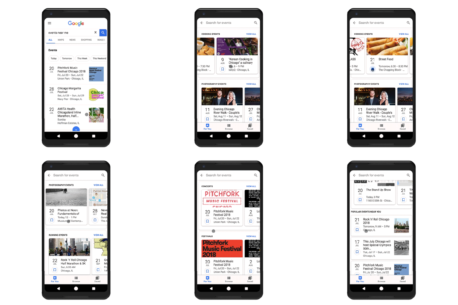
Last May, Google launched a new events feature designed to help web searchers more easily find things to do nearby, while also challenging Facebook’s dominance in the local events space. Today, Google is updating event search with personalized event suggestions, and well as a new design that puts more event information directly in the search results.

When the feature first launched last year, Google said it was built in response to the millions of search queries the company saw daily for finding local events and activities.

However, it was also clearly an area where Google had ceded ground to Facebook. The social network said last fall that 100 million people were using Facebook Events on a daily basis, and 650 million were using it across the network. Those numbers have surely grown since.

The original design for Google’s events search offered web searchers a list of events they could filter by category and date. Meanwhile, the event listings themselves were powered by data from Eventbrite, Ticketmaster, SeatGeek, Meetup, Vividseats, Jambase, LiveNation, Burbio, Allevents.in, Bookmyshow.com, StubHub, Bandsintown, Yext and Eventful.

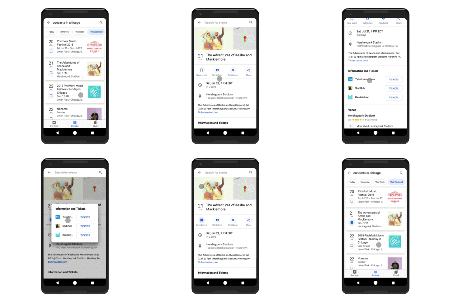
Now, Google is returning these event results in a new format – instead of more standard search results, they appear as cards, each with a little bookmark icon you can click on to save the event details for future reference.

In addition, when you tap on one of the event listings’ cards, you’re directed to a more information-rich page, offering the date, time, location, and shortcuts to save the event, buy tickets, get directions, or share it with others. The design looks even more like a Facebook event page, albeit without a discussion section for posts and comments.

Clicking on the “Get Tickets” button will pop up a window that links to ticket resellers for the event in question – like Ticketmaster or StubHub, for example.

As users continue to click, browse and save events, the system will also be trained to know what sort of events users like.

This data will be used to power the new personalized recommendations feature, found in the bottom navigation bar’s “For You” tab, which organizes suggested events by category, like “concerts,” “festivals,” “shows,” free events, and more. This page will also show you trending and popular events in the area, if you need ideas.

The feature is not currently live for everyone, but is rolling out to mobile users over the next few days, says Google.