Everything Apple

Friday 28 September 2018

Spotify ends test that required family plan subscribers to share their GPS location

Spotify has ended a test that required its family plan subscribers to verify their location, or risk losing accessing to its music streaming service. According to recent reports, the company had sent out emails to its “Premium for Family” customers which asked them to confirm their locations using GPS. The idea here is that some customers may have been sharing Family Plans, even though they’re not related, as a means of paying less for Spotify by splitting the plan’s support for multiple users. And Spotify wanted to bust them.

Spiegel Online and Quartz first reported this news on Thursday.

Of course, as these reports pointed out, asking users to confirm a GPS location is a poor means of verification. Families often have members who live or work outside the home – they may live abroad, have divorced or separated parents, have kids in college, they may travel for work, or any other number of reasons.

But technically, these sorts of situations are prohibited by Spotify’s family plan terms – the rules require all members to share a physical address. That rule hadn’t really been as strictly enforced before, so many didn’t realize they had broken it when they added members who don’t live at home.

Customers were also uncomfortable with how Spotify wanted to verify their location – instead of entering a mailing address for the main account, for instance, they were asked for their exact (GPS) location.

The emails also threatened that failure to verify the account this way could cause them to lose access to the service.

Family plans are often abused by those who use them as a loophole for paying full price. For example, a few years ago, Amazon decided to cut down on Prime members sharing their benefits, because they found these were being broadly shared outside immediate families. In its case, it limited sharing to two adults who could both authorize and use the payment cards on file, and allowed them to create other, more limited profiles for the kids.

Spotify could have done something similar. It could have asked Family Plan adult subscribers to re-enter their payment card information to confirm their account, or it could have designated select slots for child members with a different set of privileges to make sharing less appealing.

Maybe it will now reconsider how verification works, given the customer backlash.

We understand the verification emails were only a small-scale test of a new system, not something Spotify is rolling out to all users. The emails were sent out in only four of Spotify’s markets, including the U.S.

And the test only ran for a short time before Spotify shut it down.

Reached for comment, a Spotify spokesperson confirmed this, saying:

“Spotify is currently testing improvements to the user experience of Premium for Family with small user groups in select markets. We are always testing new products and experiences at Spotify, but have no further news to share regarding this particular feature test at this time.”


Wednesday 26 September 2018

FCC cracks the whip on 5G deployment against protests of local governments

The FCC is pushing for speedy deployment of 5G networks nationwide with an order adopted today that streamlines what it perceives as a patchwork of obstacles, needless costs, and contradictory regulations at the state level. But local governments say the federal agency is taking things too far.

5G networks will consist of thousands of wireless installations, smaller and more numerous than cell towers. This means that wireless companies can’t use existing facilities, for all of it at least, and will have to apply for access to lots of new buildings, utility poles, and so on. It’s a lot of red tape, which of course impedes deployment.

To address this, the agency this morning voted 3 to 1 along party lines to adopt the order (PDF) entitled “Accelerating Wireline Broadband Deployment by Removing Barriers to Infrastructure Investment.” What it essentially does is exert FCC authority over state wireless regulators and subject them to a set of new rules superseding their own.

First the order aims to literally speed up deployment by standardizing new, shorter “shot clocks” for local governments to respond to applications. They’ll have 90 days for new locations and 60 days for existing ones — consistent with many existing municipal timeframes but now to be enforced as a wider standard. This could be good, as the longer time limits were designed for consideration of larger, more expensive equipment.

On the other hand, some cities argue, it’s just not enough time — especially considering the increased volume they’ll be expected to process.

Cathy Murillo, Mayor of Santa Barbara, writes in a submitted comment:

The proposed ‘shot clocks’ would unfairly and unreasonably reduce the time needed for proper application review in regard to safety, aesthetics, and other considerations. By cutting short the necessary review period, the proposals effectively shift oversight authority from the community and our elected officials to for-profit corporations for wireless equipment installations that can have significant health, safety, and aesthetic impacts when those companies have little, if any, interest to respect these concerns.

Next, and even less popular, is the FCC’s take on fees for applications and right-of-way paperwork. These fees currently vary widely, because as you might guess it is far more complicated and expensive — often by an order of magnitude or more — to approve and process an application for (not to mention install and maintain) an antenna on 5th Avenue in Manhattan than it is in outer Queens. These are, to a certain extent anyway, natural cost differences.

The order limits these fees to “a reasonable approximation of their costs for processing,” which the FCC estimated at about $500 for one application for up to five installations or facilities, $100 for additional facilities, and $270 per facility per year all inclusive.

For some places, to be sure, that may be perfectly reasonable. But as Catherine Pugh, Mayor of Baltimore, put it in a letter to the FCC protesting the proposed rules, it sure isn’t for her city.

An annual fee of $270 per attachment, as established in the above document, is unconscionable when the facility may yeild profits, in some cases, many times that much in a given month. The public has invested and installed these assets [i.e. utility poles and other public infrastructure], not the industry. The industry does not own these assets; the public does. Under these circumstances, it is entirely reasonable that the public should be able to charge what it believes to be a fair price.

There’s no doubt that excessive fees can curtail deployment and it would be praiseworthy of the FCC to tackle that. But the governments they are hemming in don’t seem to appreciate being told what is reasonable and what isn’t.

“It comes down to this: three unelected officials on this dais are telling state and local leaders all across the country what they can and cannot do in their own backyards,” said FCC Commissioner Jessica Rosenworcel in a statement presented at the vote. “This is extraordinary federal overreach.”

New York City’s commissioner of information technology told Bloomberg that his office is “shocked” by the order, calling it “an unnecessary and unauthorized gift to the telecommunications industry and its lobbyists.”

The new rules may undermine deployment deals that already exist or are under development. After all, if you were a wireless company, would you still commit to paying $2,000 per facility when the feds just gave you a coupon for 80 percent off? And if you were a city looking at a budget shortfall of millions because of this, wouldn’t you look for a way around it?

Chairman Ajit Pai argued in a statement that “When you raise the cost of deploying wireless infrastructure, it is those who live in areas where the investment case is the most marginal—rural areas or lower-income urban areas—who are most at risk of losing out.”

But the basic market economics of this don’t seem to work out. Big cities cost more and are more profitable; rural areas cost less and are less profitable. Under the new rules, big cities and rural areas will cost the same, but the former will be even more profitable. Where would you focus your investments?

The FCC also unwisely attempts to take on the aesthetic considerations of installations. Cities have their own requirements for wireless infrastructure, such as how it’s painted, where it can be located, what size it can be when in this or that location. But the FCC seems (as it does so often these days) to want to accommodate the needs of wireless providers rather than the public.

Wireless companies complain that the rules are overly restrictive or subjective, and differ too greatly from one place to another. Municipalities contend that the restrictions are justified and, at any rate, their prerogative to design and enforce.

“Given these differing perspectives and the significant impact of aesthetic requirements on the ability to deploy infrastructure and provide service, we provide guidance on whether and in what circumstances aesthetic requirements violate the [Communications] Act,” the FCC’s order reads. In other words, wireless industry gripes about having to paint their antennas or not hang giant microwave arrays in parks are being federally codified.

“We conclude that aesthetics requirements are not preempted if they are (1) reasonable, (2) no more burdensome than those applied to other types of infrastructure deployments, and (3) published in advance,” the order continues. Does that sound kind of vague to you? Whether an city’s aesthetic requirement is “reasonable” is hardly the jurisdiction of a communications regulator.

For instance, Hudson, Ohio city manager Jane Howington writes in a comment on the order that the city has 40-foot limits on pole heights, to which the industry has already agreed, but which would be increased to 50 under the revisions proposed in the rule. Why should a federal authority be involved in something so clearly under local jurisdiction and expertise?

This isn’t just an annoyance. As with the net neutrality ruling, legal threats from states can present serious delays and costs.

“Every major state and municipal organization has expressed concern about how Washington is seeking to assert national control over local infrastructure choices and stripping local elected officials and the citizens they represent of a voice in the process,” said Rosenworcel. “I do not believe the law permits Washington to run roughshod over state and local authority like this and I worry the litigation that follows will only slow our 5G future.”

She also points out that the predicted cost savings of $2 billion — by telecoms, not the public — may be theorized to spur further wireless deployment, but there is no requirement for companies to use it for that, and in fact no company has said it will.

In other words, there’s every reason to believe that this order will sow discord among state and federal regulators, letting wireless companies save money and sticking cities with the bill. There’s certainly a need to harmonize regulations and incentivize wireless investment (especially outside city centers), but this doesn’t appear to be the way to go about it.

Inside Facebook Stories’ quest for originality amidst 300M users

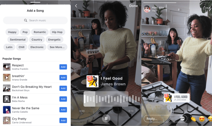
There’s a secret Facebook app called Blink. Built for employees only, it’s how the company tests out new video formats its hoping will become the next Boomerang or SuperZoom. They range from artsy Blur effects to a way even old Android phones can use Slo-Mo. One exciting format involves audio beat detection that syncs visual embellishments to songs playing in the background or added via the Music stickers that are  coming to Facebook Stories after debuting on Instagram.

“When we first formed the team . . . we brought in film makers and cinematographers to help the broader team understand the tropes around storytelling and filmmaking” says Dantley Davis, Facebook Stories’ Director Of Design. He knows those tropes himself, having spent seven years at Netflix leading the design of its apps and absorbing creative tricks from countless movies. He wants to democratize those effects once trapped inside expensive desktop editing software. “We’re working on formats to enable people to take the video they have and turn it into something special.”

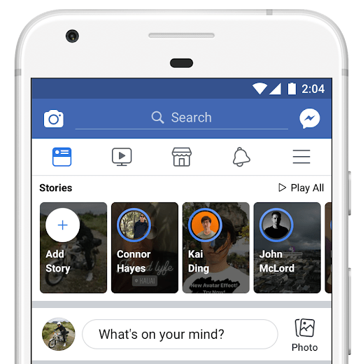
For all the jabs about Facebook stealing Stories from Snapchat, it’s working hard to differentiate. That’s in part because there’s not much left to copy, and because it’s largely succeeded in conquering the prodigal startup that refused to be acquired. Snapchat’s user count shrank last quarter to 188 million daily users. Facebook’s versions continue to grow. After announcing in May that Facebook Stories had 150 million users, with Messenger citing 70 million last September, today the company revealed they have a combined 300 million daily users.

With the success of any product comes the mandate to monetize it. That push ended up pushing out the founders of Facebook acquisition WhatsApp, and encroachment on product decision making did the same to Instagram’s founders who this week announced they were resigning. Now the mandate has reached Facebook Stories which today opened up to advertisers globally. Facebook is even running “Stories School” programs to teach ad execs the visual language of ephemerality. As Stories sharing is predicted to surpass feed sharing in 2019, Facebook is counting on the ephemeral slideshows to sustain its ad revenue. Fears they wouldn’t lopped $120 billion off Facebook’s market cap this summer.

But to run ads you need viewers and that will require responses to questions that have dogged Facebook Stories since its debut in early 2017: Why do I need Stories here too when I already have Instagram Stories and WhatsApp Status.

Facebook user experience research manager Liz Keneski

The answer may be creativity, but Facebook is taking a scientific approach to determining which creative tools to build. Liz Keneski is a user experience research manager at Facebook. She leads the investigative trips, internal testing, and focus groups that shape Facebook’s products. Keneski laid out the different types of research Facebook employs to go from vague idea to polished launch.

Foundational Research – “This is the really future looking research. It’s not necessarily about any specific products but trying to understand people’s needs.”

Contextual Inquiry – “People are kind enough to invite us into their homes and talk with us about how they use technology.” Sometimes Facebook does “street intercepts” where they find people in public and spend five minutes watching and discussing how they use their phone. It also conducts “diary studies” where people journal about how they spend their time with tech.

Descriptive Research – “When we’re exploring a defined product space”, this lets Facebook get feedback on exactly what users would want a new feature to do.

Participatory Design – “It’s kind of like research arts and crafts. We give people different artifacts and design elements and actually ask them to a deign what an experience that would be ideal for them might look like.”

Product Research – “Seeing how people interact with a specific product, the things they’re like or don’t like, the things they might want to change” lets Facebook figure out how to tweak features it’s built so they’re ready to launch.

Last year Facebook went on a foundational research expedition to India. Devanshi Bhandari who works on the globalization. She discovered that even in emerging markets where Snapchat never got popular, people already knew how to use Stories. “We’ve been kind of surprised to learn . . . Ephemeral sharing wasn’t as new to some people as we expected” she tells me. It turns out there are regional Stories copycats around the globe.

As Bhandari dug deeper she found that people wanted more creative tools, but not at the cost of speed. So Facebook began caching the Stories tray from your last visit so it’d still appear when you open Facebook Lite without having to wait for it to load. This week, Facebook will start offering creative tools like filters inside Facebook Lite Stories by enabling them server side so users can do more than just upload unedited videos.

That trip to India ended up spawning whole new products. Bhandari noticed some users, especially women, weren’t comfortable showing their face in Stories. “People would sometimes put their thumb over the video camera but share the audio content” she tells me. That led Facebook to build Audio Stories

But to make Stories truly Facebook-y, it had to build them into all its products while solving problems rather than creating them. For example, birthday wall posts are one of the longest running emerging behaviors on the social network. But most people just post a thin, generic “happy birthday!” or “HBD” post which can feel impersonal, even dystopic. So after announcing the idea in May, Facebook is now running Birthday Stories that encourage friends to submit a short video clip of well wishes instead of bland text.

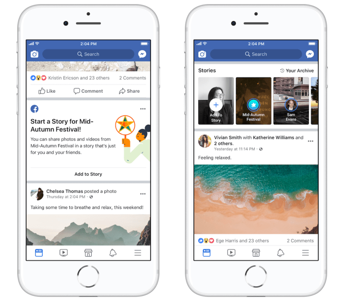
Facebook recently launched Group and Event Stories, where members can collaborate by all contributing clips that show up in the Stories tray atop the News Feed. Now Facebook is going to start building its own version of Snapchat’s Our Stories. Facebook is now testing holiday-based collaborative Stories, starting with the Mid-Autumn Festival in Vietnam. Users can opt to post to this themed Story, and friends (but not the public) will see those clips combined.

This is the final step of Facebook’s three-part plan to get people hooked on Stories, according to Facebook engineering director Rushabh Doshi who leads the product. The idea is that first, Facebook has to get people a taste of Stories by spotlighting them atop the app as well as amidst the feed. Then it makes it easy for people to post their own Stories by offering simple creative tools. And finally, it wants to “Build Stories for what people expect out of Facebook.” That encompasses all the integrations of Stories across the product.

Rushabh Doshi, Facebook’s engineering manager who oversees Stories

Still, the toughest nut to crack won’t be helping users figure out what to share but who to share to. Facebook Stories’ biggest disadvantage is that it’s built around an extremely broad social graph that includes not only friends but family, work colleagues, and distant acquaintances. That can apply a chilling effect to sharing as people don’t feel comfortable posting silly, off-the-cuff, or vulnerable Stories to such a wide audience.

Facebook has struggled with this problem in News Feed for over a decade. It ended up killing off its Friend List Feeds that let people select a subset of their friends and view a feed of just their posts because so few people were using them. Yet the problem remains rampant, and the invasion of parents and bosses has pushed users to Instagram, Snapchat, and other younger apps. Unfortunately for now, Doshi says there’s no plan to build Friend Lists or sharing to subsets of friends for Facebook Stories.

At 300 million daily users, Facebook Stories doesn’t deserve the “ghost town” label any more. People who were already accustomed to Stories elsewhere still see the feature as intrusive, interruptive, and somewhat desperate. But with 2.2 billion total Facebookers, the company can be forced to focus on one-size-fits-all solutions. Yet if Facebook’s Blink testing app can produce must-use filters and effects, and collaborative Stories can unlock new forms of sharing, Facebook Stories could find its purpose.

Google launches its group planning feature for Maps

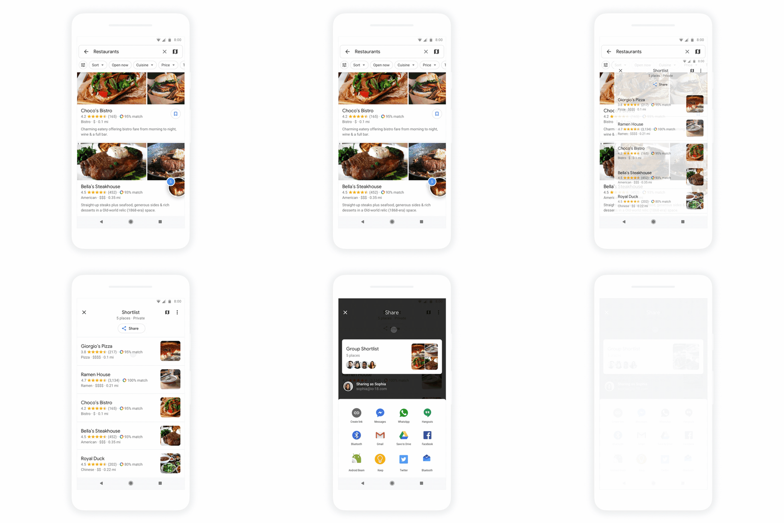
Earlier this year, Google announced its revamped Google Maps, which puts a stronger emphasis on discovery. Some of the features the company announced back then have already launched, including many of the promised discovery and exploration tools, but the one feature that was still missing was group planning. But you won’t have to wait much longer to collaboratively plan your outings with friends in Google Maps because today, these collaboration tools are finally launching.

The basic problem Google is trying to solve here probably feels familiar to everybody who has ever tried to get a group of more than two people to decide on where to go for dinner — or any other outing, really. It usually takes way too many text messages to get everybody to agree.

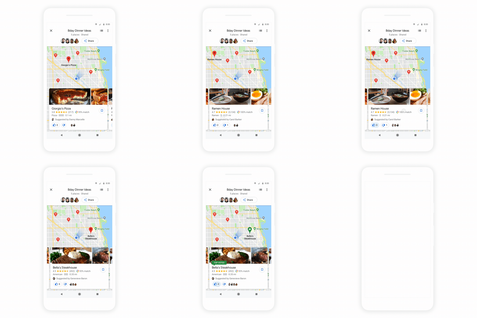
Now, however, you’ll be able to create a list of places in Google Maps and then share those with your friends. And then, like in any good democracy, your friends can vote on where to go. Group members can also veto places by removing them from the shortlist and add other ones that they’d prefer (nobody said democracy was easy, right?).

Once you have created a list, you can share it just like any other link and your friends will be taken right to Google Maps on mobile or the web to join in the planning fun.

Tuesday 25 September 2018

See the new iPhone’s ‘focus pixels’ up close

The new iPhones have excellent cameras, to be sure. But it’s always good to verify Apple’s breathless on-stage claims with first-hand reports. We have our own review of the phones and their photography systems, but teardowns provide the invaluable service of letting you see the biggest changes with your own eyes — augmented, of course, by a high-powered microscope.

We’ve already seen iFixit’s solid-as-always disassembly of the phone, but TechInsights gets a lot closer to the device’s components — including the improved camera of the iPhone XS and XS Max.

Although the optics of the new camera are as far as we can tell unchanged since the X, the sensor is a new one and is worth looking closely at.

Microphotography of the sensor die show that Apple’s claims are borne out and then some. The sensor size has increased from 32.8mm2 to 40.6mm2 — a huge difference despite the small units. Every tiny bit counts at this scale. (For comparison, the Galaxy S9 is 45mm2, and the soon-to-be-replaced Pixel 2 is 25mm2.)

The pixels themselves also, as advertised, grew from 1.22 microns (micrometers) across to 1.4 microns — which should help with image quality across the board. But there’s an interesting, subtler development that has continually but quietly changed ever since its introduction: the “focus pixels.”

That’s Apple’s brand name for phase detection autofocus (PDAF) points, found in plenty of other devices. The basic idea is that you mask off half a sub-pixel every once in a while (which I guess makes it a sub-sub-pixel), and by observing how light enters these half-covered detectors you can tell whether something is in focus or not.

Of course, you need a bunch of them to sense the image patterns with high fidelity, but you have to strike a balance: losing half a pixel may not sound like much, but if you do it a million times, that’s half a megapixel effectively down the drain. Wondering why that all the PDAF points are green? Many camera sensors use an “RGBG” sub-pixel pattern, meaning there are two green sub-pixels for each red and blue one — it’s complicated why. But there are twice as many green sub-pixels and therefore the green channel is more robust to losing a bit of information.


Apple introduced PDAF in the iPhone 6, but as you can see in TechInsights’ great diagram, the points are pretty scarce. There’s one for maybe every 64 sub-pixels, and not only that, they’re all masked off in the same orientation: either the left or right half gone.

The 6S and 7 Pluses saw the number double to one PDAF point per 32 sub-pixels. And in the 8 Plus, the number is improved to one per 20 — but there’s another addition: now the phase detection masks are on the tops and bottoms of the sub-pixels as well. As you can imagine, doing phase detection in multiple directions is a more sophisticated proposal, but it could also significantly improve the accuracy of the process. Autofocus systems all have their weaknesses, and this may have addressed one Apple regretted in earlier iterations.

Which brings us to the XS (and Max, of course), in which the PDAF points are now one per 16 sub-pixels, having increased the frequency of the vertical phase detection points so that they’re equal in number to the horizontal one. Clearly the experiment paid off and any consequent light loss has been mitigated or accounted for.

I’m curious how the sub-pixel patterns of Samsung, Huawei, and Google phones compare, and I’m looking into it. But I wanted to highlight this interesting little evolution. It’s an interesting example of the kind of changes that are hard to understand when explained in simple number form — we’ve doubled this, or there are a million more of that — but which make sense when you see them in physical form.

The new era in mobile

A future dominated by autonomous vehicles (AVs) is, for many experts, a foregone conclusion. Declarations that the automobile will become the next living room are almost as common — but, they are imprecise. In our inevitable driverless future, the more apt comparison is to the mobile device. As with smartphones, operating systems will go a long way toward determining what autonomous vehicles are and what they could be. For mobile app companies trying to seize on the coming AV opportunity, their future depends on how the OS landscape shapes up.

By most measures, the mobile app economy is still growing, yet the time people spend using their apps is actually starting to dip. A recent study reported that overall app session activity grew only 6 percent in 2017, down from the 11 percent growth it reported in 2016. This trend suggests users are reaching a saturation point in terms of how much time they can devote to apps. The AV industry could reverse that. But just how mobile apps will penetrate this market and who will hold the keys in this new era of mobility is still very much in doubt.

When it comes to a driverless future, multiple factors are now converging. Over the last few years, while app usage showed signs of stagnation, the push for driverless vehicles has only intensified. More cities are live-testing driverless software than ever, and investments in autonomous vehicle technology and software by tech giants like Google and Uber (measured in the billions) are starting to mature. And, after some reluctance, automakers have now embraced this idea of a driverless future. Expectations from all sides point to a “passenger economy” of mobility-as-a-service, which, by some estimates, may be worth as much as $7 trillion by 2050.

For mobile app companies this suggests several interesting questions: Will smart cars, like smartphones before them, be forced to go “exclusive” with a single OS of record (Google, Apple, Microsoft, Amazon/AGL), or will they be able to offer multiple OS/platforms of record based on app maturity or functionality? Or, will automakers simply step in to create their own closed loop operating systems, fragmenting the market completely?

Automakers and tech companies clearly recognize the importance of “connected mobility.”

Complicating the picture even further is the potential significance of an OS’s ability to support multiple Digital Assistants of Record (independent of the OS), as we see with Google Assistant now working on iOS. Obviously, voice NLP/U will be even more critical for smart car applications as compared to smart speakers and phones. Even in those established arenas the battle for OS dominance is only just beginning. Opening a new front in driverless vehicles could have a fascinating impact. Either way, the implications for mobile app companies are significant.

Looking at the driverless landscape today there are several indications as to which direction the OSes in AVs will ultimately go. For example, after some initial inroads developing their own fleet of autonomous vehicles, Google has now focused almost all its efforts on autonomous driving software while striking numerous partnership deals with traditional automakers. Some automakers, however, are moving forward developing their own OSes. Volkswagen, for instance, announced that vw.OS will be introduced in VW brand electric cars from 2020 onward, with an eye toward autonomous driving functions. (VW also plans to launch a fleet of autonomous cars in 2019 to rival Uber.) Tesla, a leader in AV, is building its own unified hardware-software stack. Companies like Udacity, however, are building an “open-source” self-driving car tech. Mobileye and Baidu have a partnership in place to provide software for automobile manufacturers.

Clearly, most smartphone apps would benefit from native integration, but there are several categories beyond music, voice and navigation that require significant hardware investment to natively integrate. Will automakers be interested in the Tesla model? If not, how will smart cars and apps (independent of OS/voice assistant) partner up? Given the hardware requirements necessary to enable native app functionality and optimal user experience, how will this force smart car manufacturers to work more seamlessly with platforms like AGL to ensure competitive advantage and differentiation? And, will this commoditize the OS dominance we see in smartphones today?

It’s clearly still early days and — at least in the near term — multiple OS solutions will likely be employed until preferred solutions rise to the top. Regardless, automakers and tech companies clearly recognize the importance of “connected mobility.” Connectivity and vehicular mobility will very likely replace traditional auto values like speed, comfort and power. The combination of Wi-Fi hotspot and autonomous vehicles (let alone consumer/business choice of on-demand vehicles) will propel instant conversion/personalization of smart car environments to passenger preferences. And, while questions remain around the how and the who in this new era in mobile, it’s not hard to see the why.

Americans already spend an average of 293 hours per year inside a car, and the average commute time has jumped around 20 percent since 1980. In a recent survey (conducted by Ipsos/GenPop) researchers found that in a driverless future people would spend roughly a third of the time communicating with friends and family or for business and online shopping. By 2030, it’s estimated the autonomous cars “will free up a mind-blowing 1.9 trillion minutes for passengers.” Another analysis suggested that even with just 10 percent adoption, driverless cars could account for $250 billion in driver productivity alone.

Productivity in this sense extends well beyond personal entertainment and commerce and into the realm of business productivity. Use of integrated display (screen and heads-up) and voice will enable business multi-tasking from video conferencing, search, messaging, scheduling, travel booking, e-commerce and navigation. First-mover advantage goes to the mobile app companies that first bundle into a single compelling package information density, content access and mobility. An app company that can claim 10 to 15 percent of this market will be a significant player.

For now, investors are throwing lots of money at possible winners in the autonomous automotive race, who, in turn, are beginning to define the shape of the mobile app landscape in a driverless future. In fact, what we’re seeing now looks a lot like the early days of smartphones with companies like Tesla, for example, applying an Apple-esque strategy for smart car versus smartphone. Will these OS/app marketplaces be dominated by a Tesla — or Google (for that matter) — and command a 30 percent revenue share from apps, or will auto manufacturers with proprietary platforms capitalize on this opportunity? Questions like these — while at the same time wondering just who the winners and losers in AV will be — mean investment and entrepreneurship in the mobile app sector is an extremely lucrative but risky gamble.

Monday 24 September 2018

MetroPCS is now Metro by T-Mobile

It’s been five years since T-Mobile picked up MetroPCS, and now the prepaid service is finally getting a fresh coat of paint. The “PCS” bit is getting the old heave ho, while the brand’s owners are letting you know who’s boss with the new Metro by T-Mobile brand name.

The new name involves some new plans, along with a couple of perks from key partners. There are two new (pricier) tiers, in addition to the standard ones. The new unlimited plans run $50 and $60 a month, and both include storage via Google One.

That makes the newly rebranded service the first to offer up access to Google’s new storage plan. The cloud deal also offers access to Google Experts, who can help you troubleshoot issues with any Google service.

The $60 a month plan, meanwhile, tosses in Amazon Prime for Google measure. That’s not exactly a solid reason to upgrade in an of itself, given that an Amazon Prime plan currently runs $119 a year, but the more premium plan offers 15GB of LTE data for its mobile hotspot versus 5GB.

You can play Alto’s Adventure on your Mac now

Everyone’s favorite endless, serene snowboarding game just made the leap from mobile to the Mac App Store. Available now for $9.99, Alto’s Adventure for Mac is a desktop port of the side-scrolling snowscape game that’s won hearts and accolades since it first hit iOS in 2015.

Earlier this year, the team behind Alto’s Adventure introduced a second game, Alto’s Odyssey, which trades the first game’s snowy terrain for sand and sun while maintaining its charm. If you’ve already spent some time with Alto’s Odyssey, the Mac version of the classic is a good reason to circle back.

The game’s serene setting and blissed out music make Alto’s Adventure eminently replayable, even if you’ve already sunk tens of hours into lengthening your scarf in an infinite procedurally generated snowy world dotted with charming villages, dramatic slopes and many, many things to trip over.

If you’ve yet to dive into Alto’s Adventure, and we really recommend that you do, the Mac version is probably a good starting place. For everyone else, progress in the game syncs across devices through iCloud, so it’s a good excuse to push a little further into one of the most thoughtful, pleasant mobile game experiences to date.

And while you’re hanging out in the Mac App Store, don’t forget to update to Mojave — Apple’s latest desktop operating system is available now.

Snapchat lets you take a photo of an object to buy it on Amazon

See, snap, sale. In a rare partnership for Amazon, the commerce giant will help Snapchat challenge Instagram and Pinterest for social shopping supremacy. Today Snapchat announced it’s slowly rolling out a new visual product search feature, confirming TechCrunch’s July scoop about this project codenamed “Eagle”.

Users can use Snapchat’s camera to scan a physical object or barcode which brings up a card showing that item and similar ones along with their title, price, thumbnail image, average review score and Prime availability. When the tap on one, they’ll be sent to Amazon’s app or site to buy it. Snapchat determines if you’re scanning a song, QR Snapcode, or object, and then Amazon’s machine vision tech recognizes logos, artwork, package covers, or other unique identifying marks to find the product. It’s rolling out to small percentage of US users first before Snap considers other countries.

Snap refused to disclose any financial terms of the partnership. It could be earning a referral fee for each thing you buy from Amazon, or it could just be doing the legwork for free in exchange for added utility. A Snapchat spokesperson tells me it’s the latter is the motivation (without ruling out the former), as Snapchat wants its camera to become the new cursor — your point of interface betwen the real and digital worlds.

Social commerce is heating up as Instagram launches Shopping tags in Stories and a dedicated Shopping channel in Explore, while Pinterest opens up Shop The Look pins and hits 250 million monthly users. The feature should mesh well with Snap’s young and culture-obsessed audience. In the US, its users are 20 percent more likely to have made a mobile purchase than non-users, and 60 percent more likely to make impulse purchases according to studies by Murphy Research and GfK.

In the video demo above, you can see Snapchat identifying Under Armour’s HOVR shoe (amongst all its other models), and the barcode for Covergirl’s clean matte liquid makeup. That matches our scoop based on code dug out of Snapchat’s Android app by TechCrunch tipster Ishan Agarwal.

The feature could prove useful for when you don’t know the name of the product you’re looking at, as with shoes. That could turn visual search into a new form of word-of-mouth marketing where every time an owner shows off a product, they’re effectively erecting a billboard for it. Eventually, visual search could help users shop across language barriers.

Amazon is clearly warming up to social partnerships, recognizing its inadequacy in that department. Along with being named Snapchat’s official search partner, it’s also going to be bringing Alexa voice control to Facebook’s Portal video chat screen that’s reportedly debuting this week according to Cheddar’s Alex Heath.

Snapchat could use the help. It’s now losing users and money, down from 191 million to 188 million daily active users last quarter while burning $353 million. Partnering instead of trying to build all its technology in-house could help reduce that financial loss, while added utility could aid with user growth. And if Snap can convince advertiers, they might pay to educate people on how to scan their products with Snapchat.

Snap keeps saying it wants to be a “Camera Company” but it’s really an augmented reality software layer through which to see the world. The question will be whether it can change our behavior so that when we see something special, we interact with it through the camera, not just capture it.

Salesforce partners with Apple to roll deeper into mobile enterprise markets

Apple and Salesforce are both highly successful, iconic brands, who like to put on a big show when they make product announcements. Today, the two companies announced they were forming a strategic partnership with an emphasis on mobile strategy ahead of Salesforce’s enormous customer conference, Dreamforce, which starts tomorrow in San Francisco.

For Apple, which is has been establishing partnerships with key enterprise brands for the last several years, today’s news is a another big step toward solidifying its enterprise strategy by involving the largest enterprise SaaS vendor in the world.

“We’re forming a strategic partnership with Salesforce to change the way people work and to empower developers of all abilities to build world-class mobile apps,” Susan Prescott, vice president of markets, apps and services at Apple told TechCrunch.

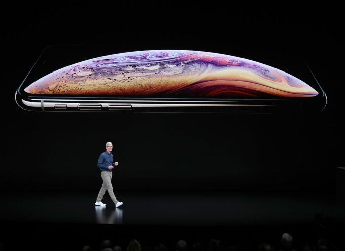
Tim Cook at Apple event on September 12, 2018 Photo: Justin Sullivan/Getty Images

Bret Taylor, president and chief product at Salesforce, who came over in the Quip deal a couple of years ago, says working together, the two companies can streamline mobile development for customers. “Every single one of our customers is on mobile. They all want world-class mobile experiences, and this enables us when we’re talking to a customer about their mobile strategy, that we can be in that conversation together,” he explained.

For starters, the partnership is going to involve three main components: The two companies are going to work together to bring in some key iOS features such Siri Shortcuts and integration with Apple’s Business Chat into the Salesforce mobile app. Much like the partnership between Apple and IBM, Apple and Salesforce will also work together to build industry-specific iOS apps on the Salesforce platform.

The companies are also working together on a new mobile SDK built specifically for Swift, Apple’s popular programming language. The plan is to provide a way to build Swift apps for iOS and deploy them natively on Salesforce’s Lightning platform.

The final component involves deeper integration with Trailhead, Salesforce’s education platform. That will involve a new Trailhead Mobile app on IOS as well as adding Swift education courses to the Trailhead catalogue to help drive adoption of the mobile SDK.

While Apple has largely been perceived as a consumer-focused organization, as we saw a shift to  companies encouraging employees to bring their own devices to work over the last six or seven years, Apple has benefited. As that has happened, it has been able to take advantage to sell more products and services and has partnered with a number of other well-known enterprise brands including IBMCiscoSAP and GE along with systems integrators Accenture and Deloitte.

The move gives Salesforce a formidable partner to continue their incredible growth trajectory. Just last year the company passed the $10 billion run rate putting it in rarified company with some of the most successful software companies in the world. In their most recent earnings call at the end of August, they reported $3.28 billion for the quarter, placing them on a run rate of over $13 billion. Connecting with Apple could help keep that momentum growing.

The two companies will show off the partnership at Dreamforce this week. It’s a deal that has the potential to work out well for both companies, giving Salesforce a more integrated iOS experience and helping Apple increase its reach into the enterprise.

Sunday 23 September 2018

Happy 10th anniversary, Android

It’s been 10 years since Google took the wraps off the G1, the first Android phone. Since that time the OS has grown from buggy, nerdy iPhone alternative to arguably the most popular (or at least populous) computing platform in the world. But it sure as heck didn’t get there without hitting a few bumps along the road.

Join us for a brief retrospective on the last decade of Android devices: the good, the bad, and the Nexus Q.

HTC G1 (2008)
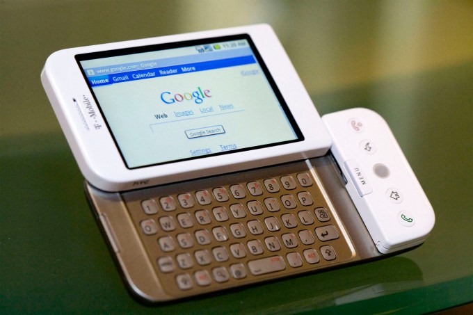
This is the one that started it all, and I have a soft spot in my heart for the old thing. Also known as the HTC Dream — this was back when we had an HTC, you see — the G1 was about as inauspicious a debut as you can imagine. Its full keyboard, trackball, slightly janky slide-up screen (crooked even in official photos), and considerable girth marked it from the outset as a phone only a real geek could love. Compared to the iPhone, it was like a poorly dressed whale.

But in time its half-baked software matured and its idiosyncrasies became apparent for the smart touches they were. To this day I occasionally long for a trackball or full keyboard, and while the G1 wasn’t pretty, it was tough as hell.

Moto Droid (2009)
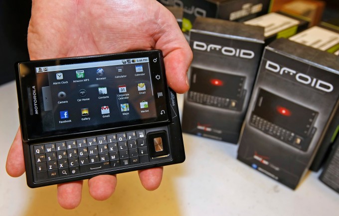
Of course, most people didn’t give Android a second look until Moto came out with the Droid, a slicker, thinner device from the maker of the famed RAZR. In retrospect, the Droid wasn’t that much better or different than the G1, but it was thinner, had a better screen, and had the benefit of an enormous marketing push from Motorola and Verizon. (Disclosure: Verizon owns Oath, which owns TechCrunch, but this doesn’t affect our coverage in any way.)

For many, the Droid and its immediate descendants were the first Android phones they had — something new and interesting that blew the likes of Palm out of the water, but also happened to be a lot cheaper than an iPhone.

HTC/Google Nexus One (2010)
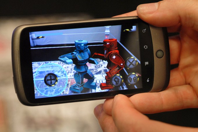
This was the fruit of the continued collaboration between Google and HTC, and the first phone Google branded and sold itself. The Nexus One was meant to be the slick, high-quality device that would finally compete toe-to-toe with the iPhone. It ditched the keyboard, got a cool new OLED screen, and had a lovely smooth design. Unfortunately it ran into two problems.

First, the Android ecosystem was beginning to get crowded. People had lots of choices and could pick up phones for cheap that would do the basics. Why lay the cash out for a fancy new one? And second, Apple would shortly release the iPhone 4, which — and I was an Android fanboy at the time — objectively blew the Nexus One and everything else out of the water. Apple had brought a gun to a knife fight.

HTC Evo 4G (2010)

Another HTC? Well, this was prime time for the now-defunct company. They were taking risks no one else would, and the Evo 4G was no exception. It was, for the time, huge: the iPhone had a 3.5-inch screen, and most Android devices weren’t much bigger, if they weren’t smaller.

The Evo 4G somehow survived our criticism (our alarm now seems extremely quaint, given the size of the average phone now) and was a reasonably popular phone, but ultimately is notable not for breaking sales records but breaking the seal on the idea that a phone could be big and still make sense. (Honorable mention goes to the Droid X.)

Samsung Galaxy S (2010)
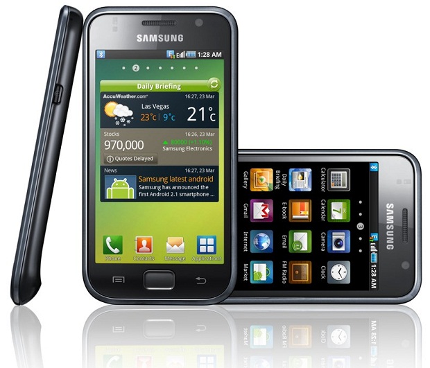
Samsung’s big debut made a hell of a splash, with custom versions of the phone appearing in the stores of practically every carrier, each with their own name and design: the AT&T Captivate, T-Mobile Vibrant, Verizon Fascinate, and Sprint Epic 4G. As if the Android lineup wasn’t confusing enough already at the time!

Though the S was a solid phone, it wasn’t without its flaws, and the iPhone 4 made for very tough competition. But strong sales reinforced Samsung’s commitment to the platform, and the Galaxy series is still going strong today.

Motorola Xoom (2011)

This was an era in which Android devices were responding to Apple, and not vice versa as we find today. So it’s no surprise that hot on the heels of the original iPad we found Google pushing a tablet-focused version of Android with its partner Motorola, which volunteered to be the guinea pig with its short-lived Xoom tablet.

Although there are still Android tablets on sale today, the Xoom represented a dead end in development — an attempt to carve a piece out of a market Apple had essentially invented and soon dominated. Android tablets from Motorola, HTC, Samsung and others were rarely anything more than adequate, though they sold well enough for a while. This illustrated the impossibility of “leading from behind” and prompted device makers to specialize rather than participate in a commodity hardware melee.

Amazon Kindle Fire (2011)
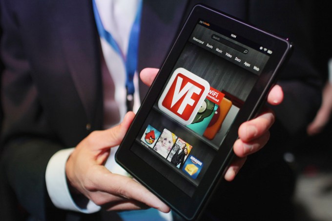
And who better to illustrate than Amazon? Its contribution to the Android world was the Fire series of tablets, which differentiated themselves from the rest by being extremely cheap and directly focused on consuming digital media. Just $200 at launch and far less later, the Fire devices catered to the regular Amazon customer whose kids were pestering them about getting a tablet on which to play Fruit Ninja or Angry Birds, but who didn’t want to shell out for an iPad.

Turns out this was a wise strategy, and of course one Amazon was uniquely positioned to do with its huge presence in online retail and the ability to subsidize the price out of the reach of competition. Fire tablets were never particularly good, but they were good enough, and for the price you paid, that was kind of a miracle.

Xperia Play (2011)

Sony has always had a hard time with Android. Its Xperia line of phones for years were considered competent — I owned a few myself — and arguably industry-leading in the camera department. But no one bought them. And the one they bought the least of, or at least proportional to the hype it got, has to be the Xperia Play. This thing was supposed to be a mobile gaming platform, and the idea of a slide-out keyboard is great — but the whole thing basically cratered.

What Sony had illustrated was that you couldn’t just piggyback on the popularity and diversity of Android and launch whatever the hell you wanted. Phones didn’t sell themselves, and although the idea of playing Playstation games on your phone might have sounded cool to a few nerds, it was never going to be enough to make it a million-seller. And increasingly that’s what phones needed to be.

Samsung Galaxy Note (2012)
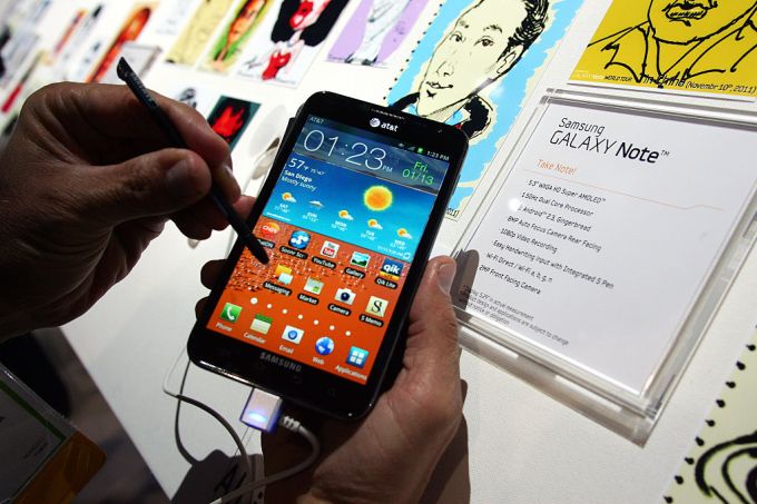
As a sort of natural climax to the swelling phone trend, Samsung went all out with the first true “phablet,” and despite groans of protest the phone not only sold well but became a staple of the Galaxy series. In fact, it wouldn’t be long before Apple would follow on and produce a Plus-sized phone of its own.

The Note also represented a step towards using a phone for serious productivity, not just everyday smartphone stuff. It wasn’t entirely successful — Android just wasn’t ready to be highly productive — but in retrospect it was forward thinking of Samsung to make a go at it and begin to establish productivity as a core competence of the Galaxy series.

Google Nexus Q (2012)

This abortive effort by Google to spread Android out into a platform was part of a number of ill-considered choices at the time. No one really knew, apparently at Google or anywhere elsewhere in the world, what this thing was supposed to do. I still don’t. As we wrote at the time:

Here’s the problem with the Nexus Q:  it’s a stunningly beautiful piece of hardware that’s being let down by the software that’s supposed to control it.

It was made, or rather nearly made in the USA, though, so it had that going for it.

HTC First — “The Facebook Phone” (2013)

The First got dealt a bad hand. The phone itself was a lovely piece of hardware with an understated design and bold colors that stuck out. But its default launcher, the doomed Facebook Home, was hopelessly bad.

How bad? Announced in April, discontinued in May. I remember visiting an AT&T store during that brief period and even then the staff had been instructed in how to disable Facebook’s launcher and reveal the perfectly good phone beneath. The good news was that there were so few of these phones sold new that the entire stock started selling for peanuts on Ebay and the like. I bought two and used them for my early experiments in ROMs. No regrets.

HTC One/M8 (2014)
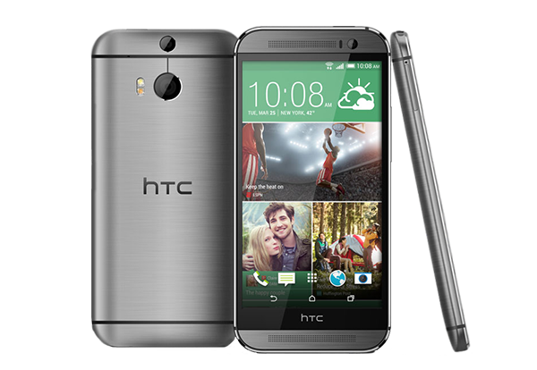
This was the beginning of the end for HTC, but their last few years saw them update their design language to something that actually rivaled Apple. The One and its successors were good phones, though HTC oversold the “Ultrapixel” camera, which turned out to not be that good, let alone iPhone-beating.

As Samsung increasingly dominated, Sony plugged away, and LG and Chinese companies increasingly entered the fray, HTC was under assault and even a solid phone series like the One couldn’t compete. 2014 was a transition period with old manufacturers dying out and the dominant ones taking over, eventually leading to the market we have today.

Google/LG Nexus 5X and Huawei 6P (2015)

This was the line that brought Google into the hardware race in earnest. After the bungled Nexus Q launch, Google needed to come out swinging, and they did that by marrying their more pedestrian hardware with some software that truly zinged. Android 5 was a dream to use, Marshmallow had features that we loved … and the phones became objects that we adored.

We called the 6P “the crown jewel of Android devices”. This was when Google took its phones to the next level and never looked back.

Google Pixel (2016)

If the Nexus was, in earnest, the starting gun for Google’s entry into the hardware race, the Pixel line could be its victory lap. It’s an honest-to-god competitor to the Apple phone.

Gone are the days when Google is playing catch-up on features to Apple, instead, Google’s a contender in its own right. The phone’s camera is amazing. The software works relatively seamlessly (bring back guest mode!), and phone’s size and power are everything anyone could ask for. The sticker price, like Apple’s newest iPhones, is still a bit of a shock, but this phone is the teleological endpoint in the Android quest to rival its famous, fruitful, contender.

Let’s see what the next ten years bring.